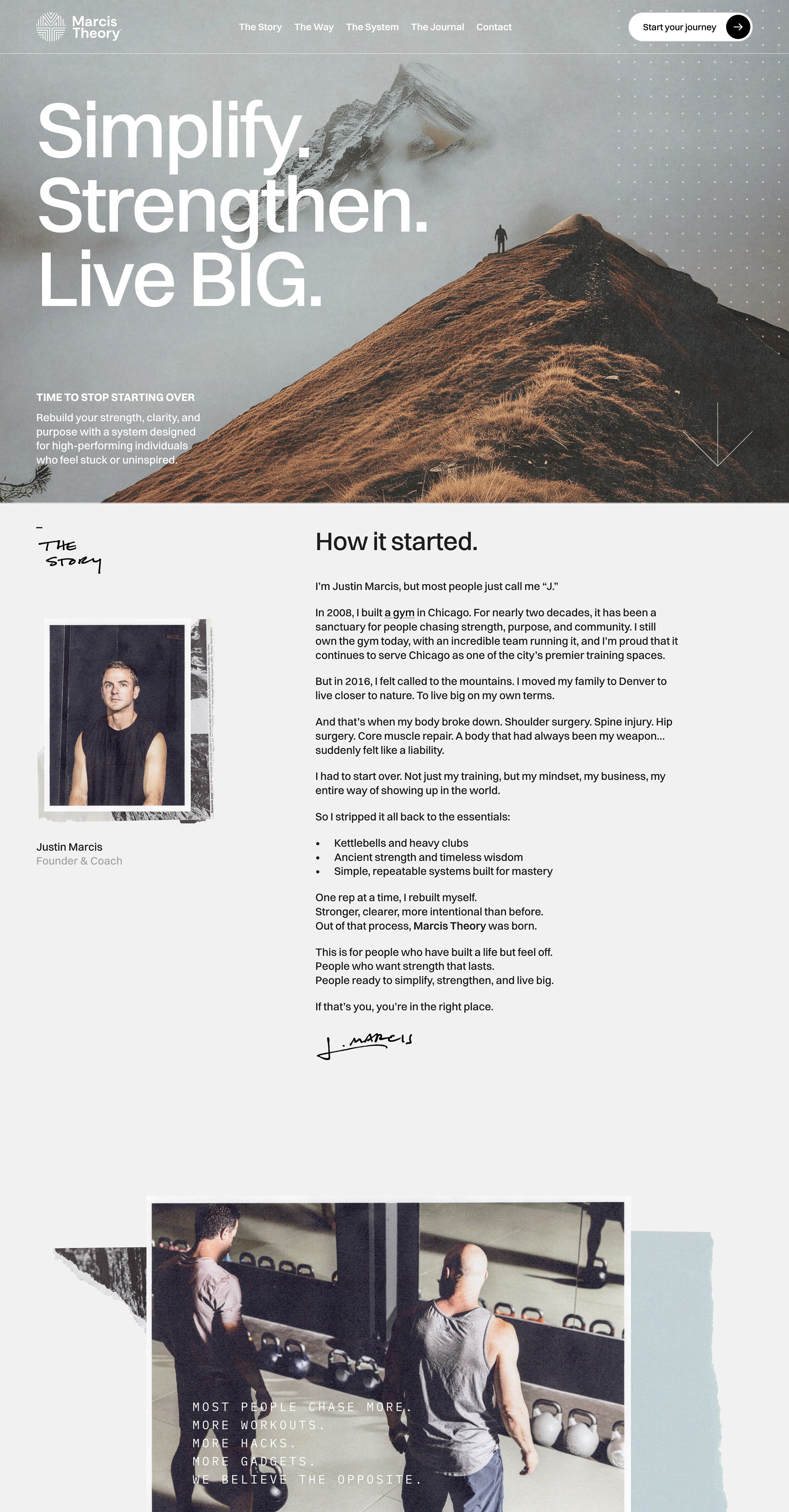
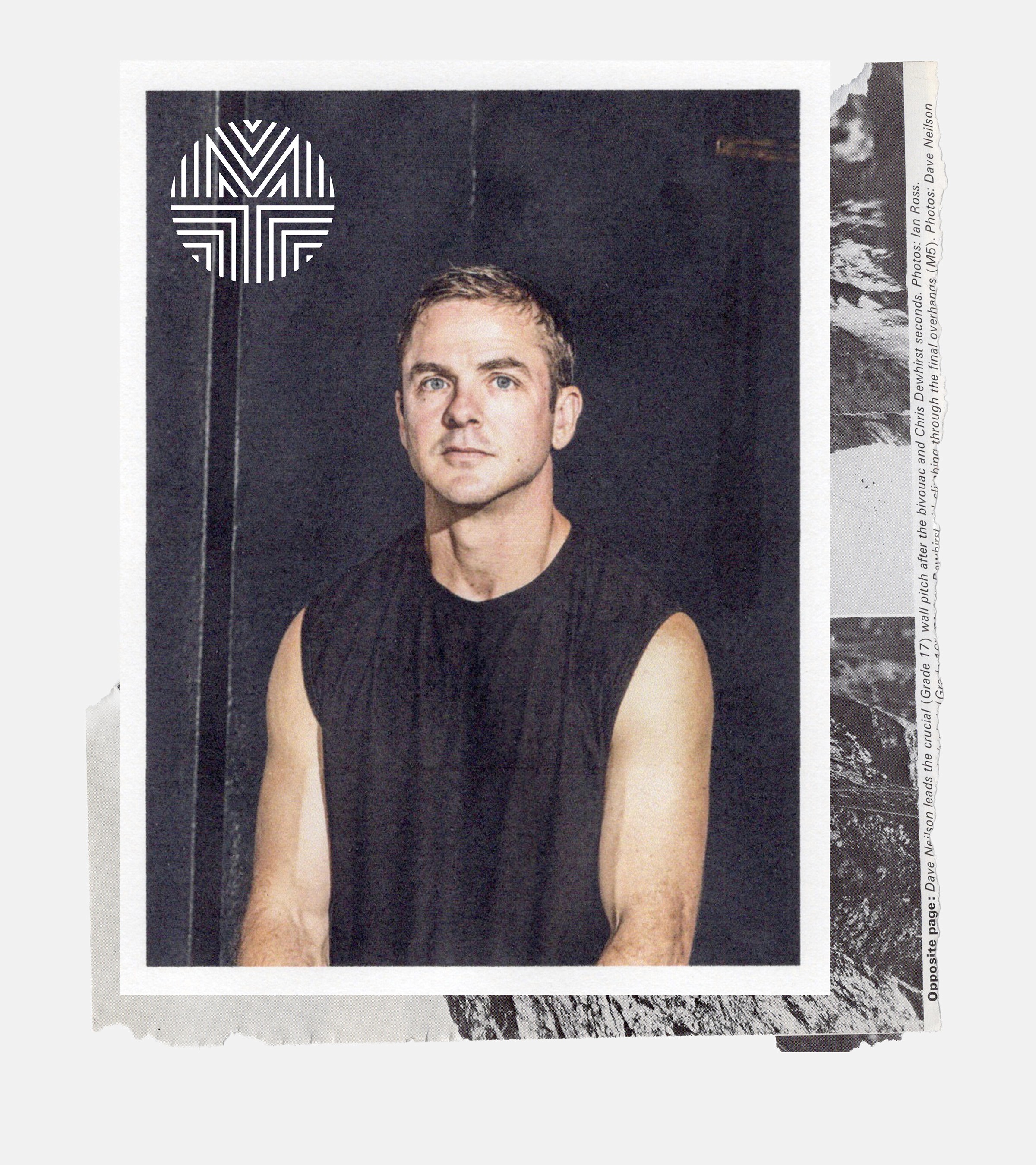

The Brand Identity
The identity had to earn the trust of men who've seen through every fitness trend. No motivational poster energy. Nothing that reads like a supplement company. The mark draws on ancient warrior symbolism and architectural geometry. The M and T fuse into a circular seal. The chevrons signal growth without announcing it. It reads like a badge, something that would hold up pressed into wax or stamped on a journal cover. The palette came from the landscape Justin trains in: charcoal, slate, earth green, sky blue, snow white. Muted and elemental. Switzer carries the type, clean and confident, with a handwritten secondary voice for the human layer.


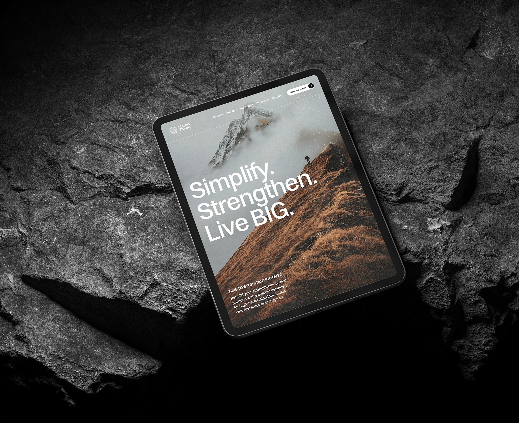
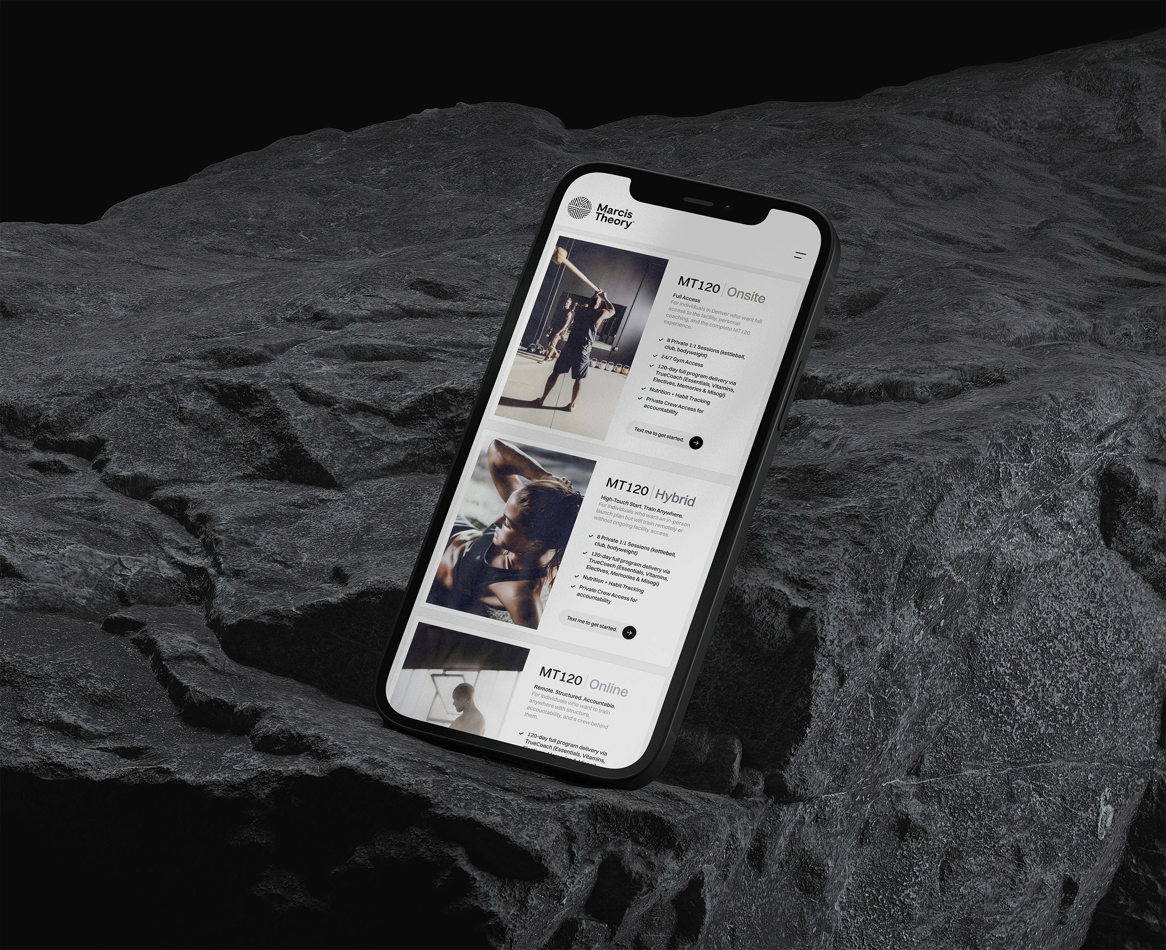
The Website
The site is built in Framer, and that choice matters. Justin's audience is skeptical by nature. The site needed to feel as considered as the methodology it represents. Framer allows for precise design control with none of the bloat of traditional platforms. The typography, layout, and motion behave exactly as designed, on every screen. It also stays easy for Justin to manage. He can update copy and add content without touching code, which matters for a solo founder running a coaching practice. If you're wondering whether Framer is right for your brand: for founders who want a site that looks designed rather than assembled, it's almost always the better call. The difference shows up the moment someone lands on your page.