The Brand Vision
Most beer branding had settled into the same vocabulary: skulls, flames, beards, blackletter. Fine for a tap handle, wrong for a publication about science.
I built the identity around the playful side of brewing, the part that happens when you're dialing in an experimental recipe. Bright palette. Editorial typography closer to a feature magazine than a product brand. A custom illustration system to carry concepts photography couldn't handle on its own, like fermentation diagrams and yeast behavior.
The goal wasn't to make the science simpler than it is. It was to make it feel as interesting as it actually is.


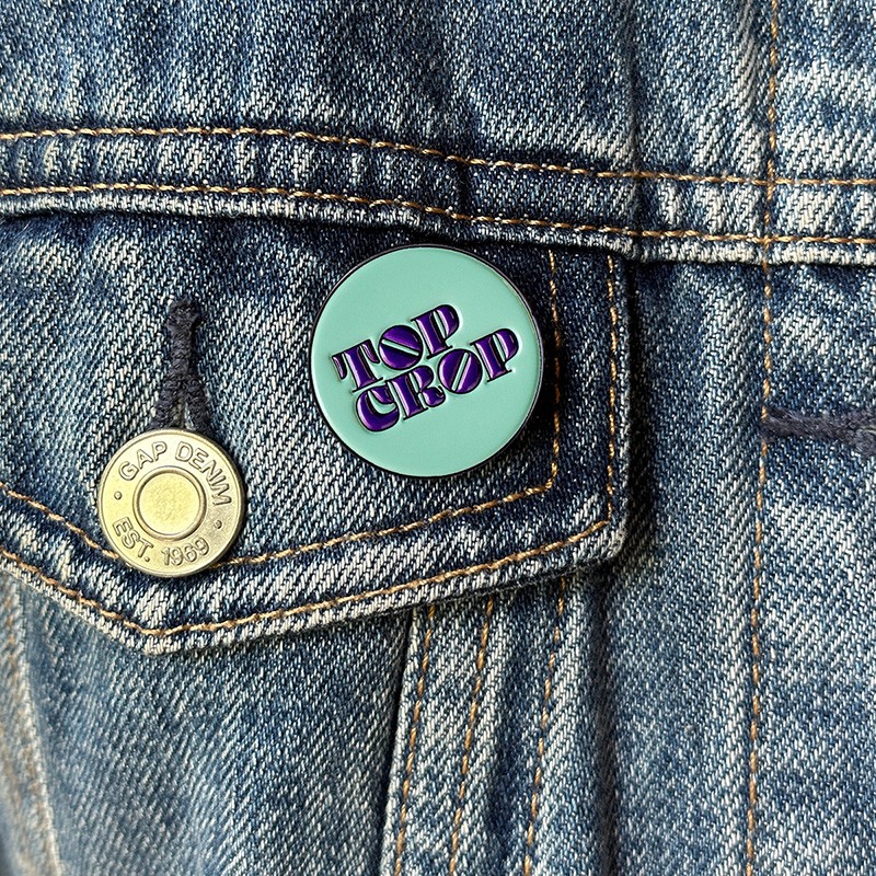
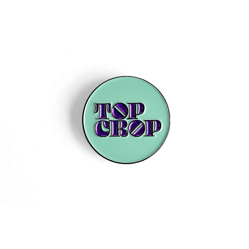
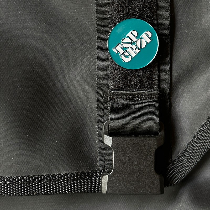
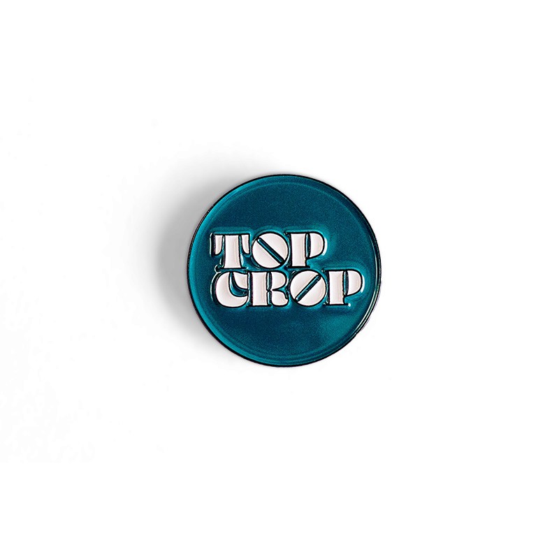
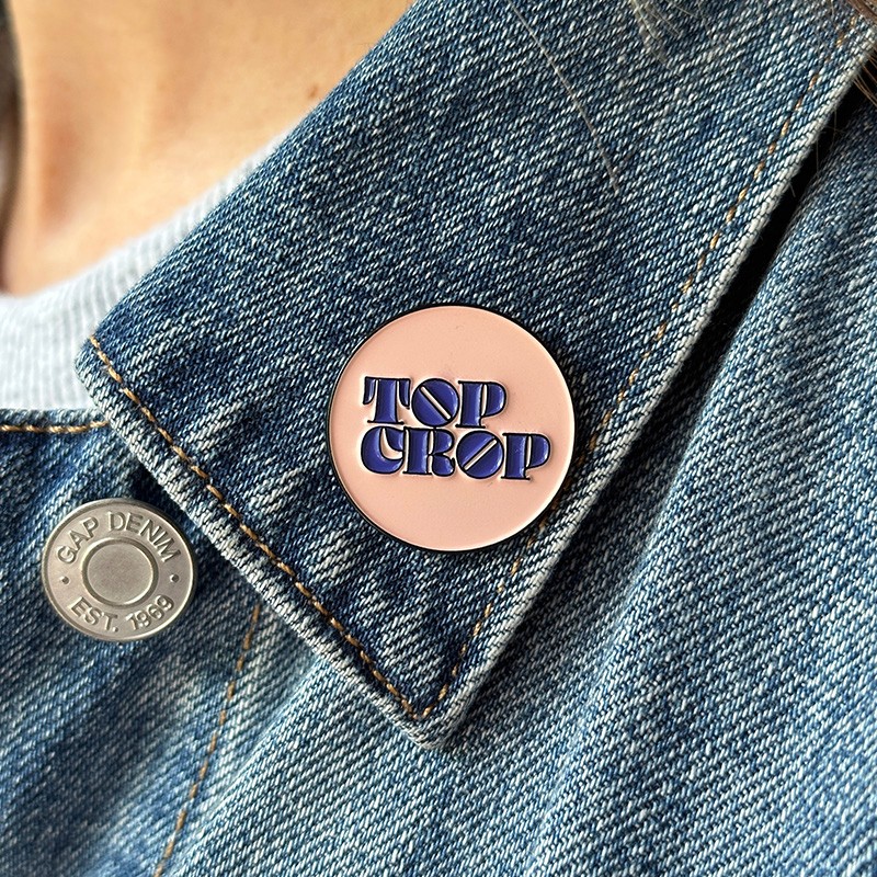
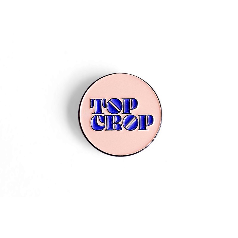
The Logo
The name came first. Top cropping is the traditional method of harvesting yeast from the top of an actively fermenting beer. It carried the right associations: hands-on, a little old-fashioned, and rooted in the craft. It also gave the project a sense of pulling the best material up to the surface, which matched the editorial mission exactly.
The mark leans into that heritage without getting precious about it. It reads as confident and editorial from a distance and as specific to brewing up close, which gives it room to work across a newspaper masthead, a website header, and a piece of merch without losing its footing.


The Website
The website is the home base for everything Top Crop publishes. I designed it in Figma and had it custom-built on Craft CMS, structured so a long-form technical piece could sit comfortably next to a recipe post without either feeling out of place.
Article layouts got real editorial attention, the kind you'd expect from a print magazine: generous typography, thoughtful image pacing, sidebars and pull quotes where the content calls for them. The result is a site that treats readers like curious adults, not users to be funneled.


The Newspaper
A project about craft deserved something you could hold.
We reprinted each major release of digital content as a broadsheet newspaper and distributed it at industry events out of custom refurbished newspaper dispenser machines, handed out on conference floors like a morning edition. After the event, leftover copies sold on the site for an old-school 50¢. They sold out fast enough that we had to do a second print run.
The papers did something the website couldn't. They turned a knowledge-sharing initiative into an artifact, something brewers would carry home and keep on a shelf. More than any other part of the project, they're the thing people still talk about.