Branding a Furniture Company — Eertmoed Studio — hero shot showcasing the Hedge House brand identity

Hedge House

Hedge House

Branding a Furniture Company

Branding a Furniture Company

Hedge House makes hardwood furniture with a focus on simple lines, understated silhouettes and details driven by purpose. Each piece is unique, custom-made and built to order in the great Midwest. In branding Hedge House, we took the same minimal approach to their identity and highlighted the company’s fresh take on a mid-century modern aesthetic.

Services

Brand Identity
Website + Digital Design
Print Design

Credits

Kyle Eertmoed, Creative Director/Designer

Kim Knoll, Designer

Rusty Cook, Designer

Philip Mast, Photographer

Recognition

Chicago Design Archive 14, Identity

“Monogram Logo,” Counter-Print, Logo

The Best Designs, Website

Brand Vision

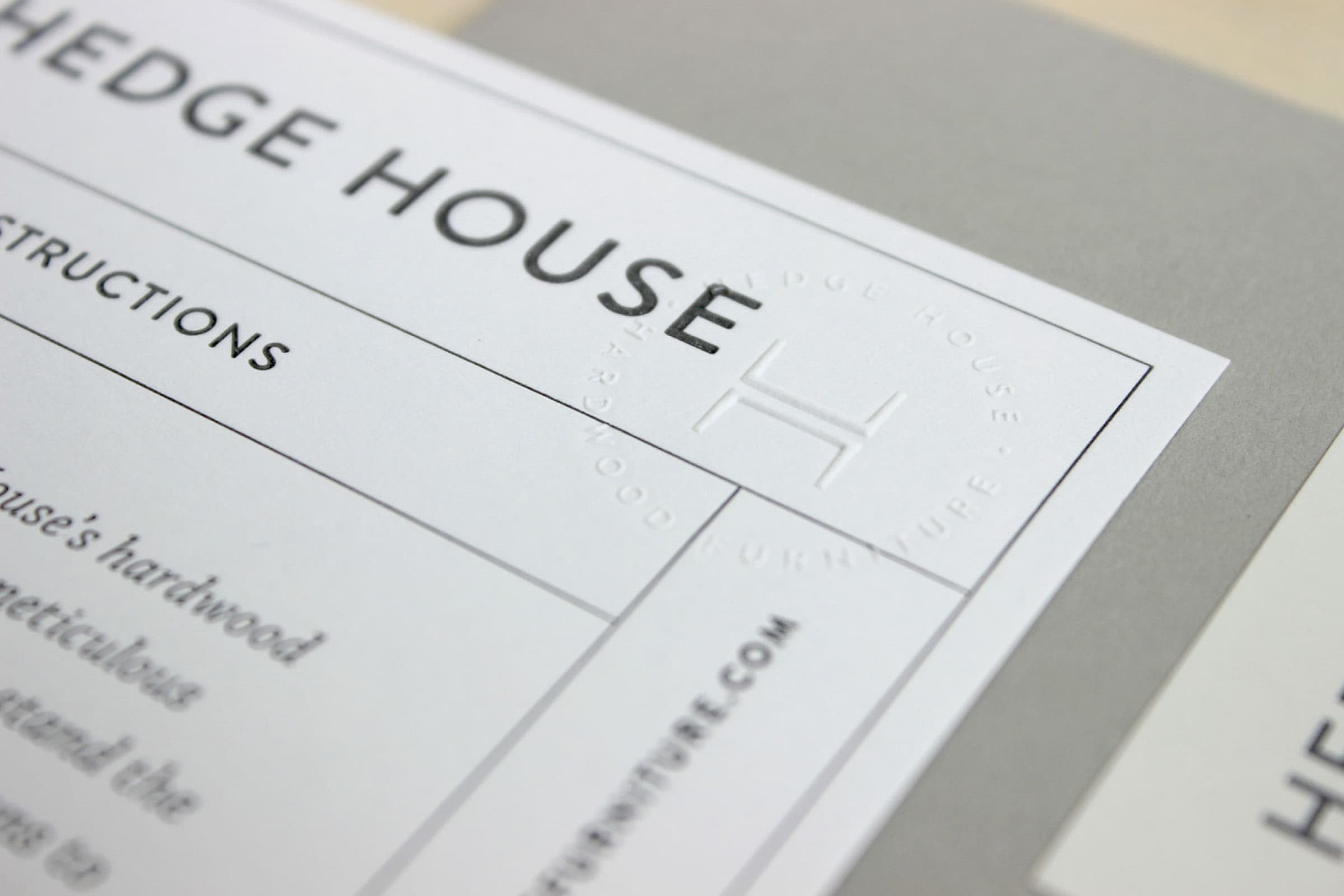
We spent a full day in the countryside of Indiana getting to know Philip and Katie, touring their home and office, and meeting the Amish men in their respective workshops who make every piece of furniture by hand. There was a peacefulness about it all—the simple silhouettes, uncomplicated details, laid back people—even the soft finish applied to their furniture was soothing. We wanted their visual identity to embody these same characteristics and provide a beautiful, but uninterrupted experience with their products. Soft grays and recycled white make up their color palette alongside natural wood tones. Blind emboss treatments and letterpressing were used for added dimension and quality.

Brand Vision

We spent a full day in the countryside of Indiana getting to know Philip and Katie, touring their home and office, and meeting the Amish men in their respective workshops who make every piece of furniture by hand. There was a peacefulness about it all—the simple silhouettes, uncomplicated details, laid back people—even the soft finish applied to their furniture was soothing. We wanted their visual identity to embody these same characteristics and provide a beautiful, but uninterrupted experience with their products. Soft grays and recycled white make up their color palette alongside natural wood tones. Blind emboss treatments and letterpressing were used for added dimension and quality.

The Logo

We used the exact silhouette from one of their tables, duplicating it and stacking them on top of one another to form an H for the icon. It’s used on its own, inside a circle and as a stamp with the company name running around it. The mark is meaningful, simple and memorable which is a perfect reflection of Hedge House’s values.

The Logo

We used the exact silhouette from one of their tables, duplicating it and stacking them on top of one another to form an H for the icon. It’s used on its own, inside a circle and as a stamp with the company name running around it. The mark is meaningful, simple and memorable which is a perfect reflection of Hedge House’s values.

“Kyle exceeded our expectations every step of the way. I’m an absolute perfectionist and was very happy with how he was able to know what I was looking for and produce a final product that was better than I could’ve imagined.”

Portrait of Philip Mast, Founder, Hedge House

Philip Mast

Founder, Hedge House

“Kyle exceeded our expectations every step of the way. I’m an absolute perfectionist and was very happy with how he was able to know what I was looking for and produce a final product that was better than I could’ve imagined.”

Portrait of Philip Mast, Founder, Hedge House

Philip Mast

Founder, Hedge House

More

projects