Discovering Reductive Design in Nashville
Inside Buck Mason: a case study in reductive design values
By Kyle Eertmoed

When Kim and I were in Nashville recently, we spent an afternoon walking around the 12South neighborhood. She popped into a shop she wanted to see, and across the street I noticed Buck Mason. It had a presence that felt understated, so I decided to check it out while she shopped.
I thought I’d be gone for a few minutes. Instead, I spent nearly an hour wandering inside by myself.
From the first room, it was clear this wasn’t a typical store. A vintage Porsche sat right in the entrance. The staff was friendly but gave me space. They weren’t trying to sell me anything, just letting me experience the place on my own. That set the tone.
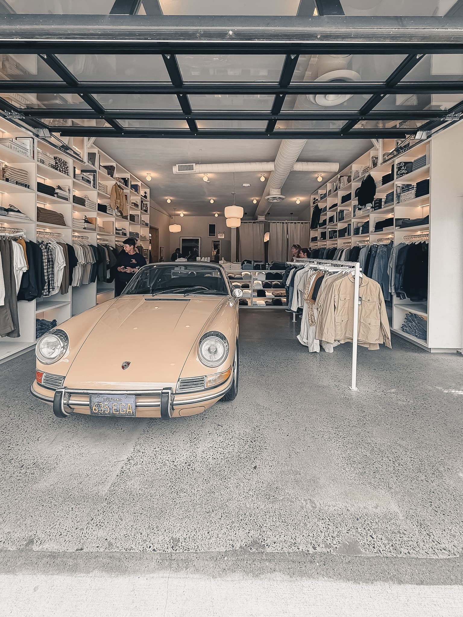

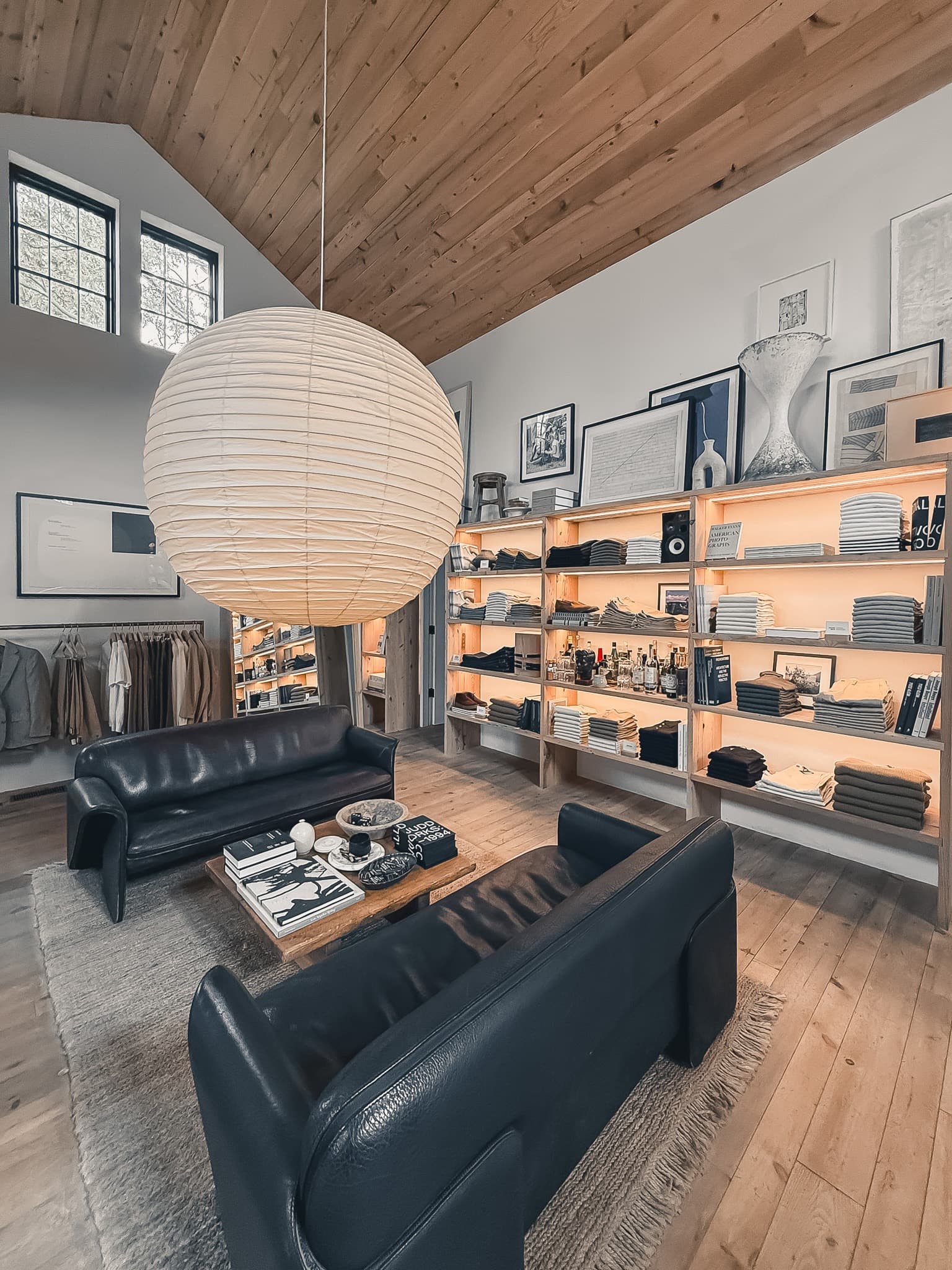
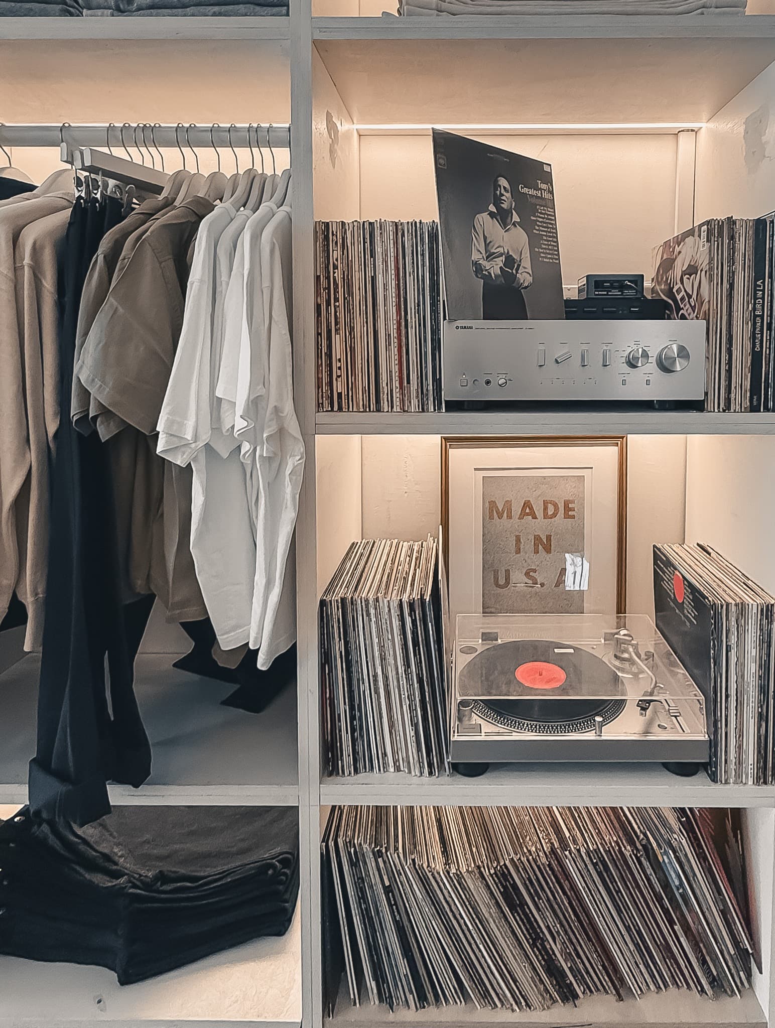
What surprised me was how the space kept unfolding. I thought it was just one room, but then another appeared, and another. Each one felt distinct but connected. The art was thoughtful, the music was just right, the clothes were displayed with room to breathe.
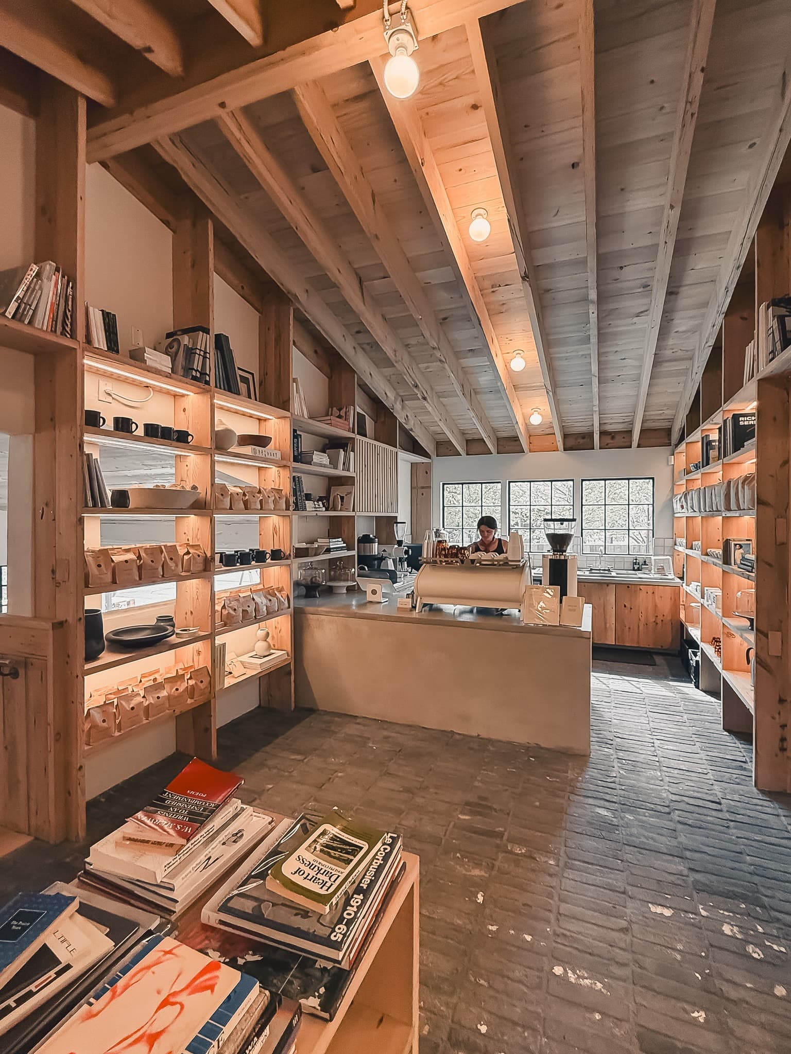
Eventually I stumbled into the center of the store where there was a full bookshop. Used, vintage, and new titles on design, photography, architecture, and fashion. On the other side, a small coffee counter served drinks from a limited menu. No fluff, no oversized menu boards, just a few well-made options.

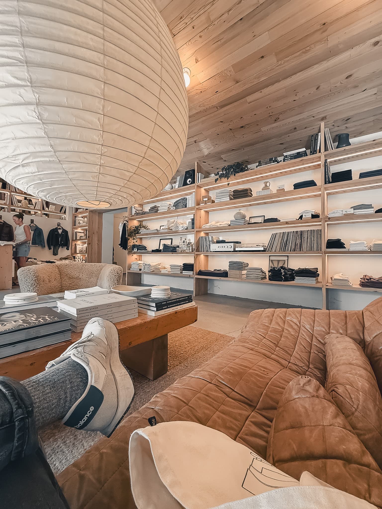
By the time Kim joined me, I had been there almost an hour. We ended up staying for another ninety minutes together. The staff even joked about how long we had been there. They weren’t wrong. But we didn’t care. The last room we discovered was the women’s section, anchored by a lounge in the middle with sofas and a table covered in books. It felt more like a living room than a retail floor. We sat, we talked, and we enjoyed the space.
That afternoon stuck with me. Buck Mason Nashville is one of the best examples I’ve seen of Reductive Design in practice. It’s not about excess or spectacle. It’s about clarity, restraint, and humanity.
Here’s how the space reflected the five values I use to define Reductive Design.
01. Organic Structure
The store unfolded naturally. Each room was its own world, yet the flow between them felt effortless. Coffee led to books, books led to clothing, and every turn created a new moment of discovery. Nothing felt forced.
02. Bold Minimalism
It takes confidence to leave space open. A single car in the middle of a room. A pared-down coffee menu with no frills. Clothing racks not packed full. The impact came from what was removed, not added.
03. Quiet Confidence
The staff mirrored the space itself. They were helpful when needed but never hovering. The store trusted the design and the details to do their work without over-explaining. That quiet confidence made the whole experience feel relaxed and welcoming.
04. Meticulous Simplicity
Every choice felt intentional. The materials were honest… wood, plaster, steel, stone. The artwork was carefully chosen, not filler. Even the smallest details, like the arrangement of books or the way light came into the space, were thoughtfully handled. Nothing felt accidental.
05. Human Technology
At its heart, the design served people. The lounge encouraged conversation. The books invited curiosity. The coffee slowed you down and gave you a reason to stay. It was retail, but it felt human. The design supported life, not just transactions


The store’s design wasn’t an accident. After doing some digging, it looks like it came from the vision of Leanne Ford, who has worked on several Buck Mason projects, and Greg Dutton Studio, known for creating spaces shaped by craft and authenticity (if I’m wrong please let me know). Ford has said that her role was to translate Buck Mason’s “easy aesthetic” into physical spaces. She also believes design should leave room for chance and synchronicity, rather than over-planning every detail. That perspective comes through in Nashville, where the layout encourages wandering and discovery. Dutton’s studio frames their work as creating “one-of-a-kind destinations shaped by a commitment to craft.” That philosophy is also visible here in the way materials and details are used with care.
I love how those intentions meet in this space. It doesn’t push itself on you. It invites you in and then lets you find your own path through it. That sense of discovery is what makes the experience stick.

For me, this is what reductive design is about. Not doing less for the sake of it, but removing what doesn’t matter so the essentials can have more presence. Spaces like this remind me why restraint is powerful. They also help me put language around ideas that are often hard to articulate.
I want to keep finding examples like this…real-world case studies that bring these values to life. I’m on a mission to study and share more of these brands. My hope is to build a living archive of reductive design, something that sharpens my own philosophy and maybe gives others a way to see the value in clarity, restraint, and presence.
If this resonates with you, I’d love for you to follow along. You can subscribe to my newsletter to get the next case study in your inbox.
Because at the end of the day, spaces like this remind us that doing less, with care and intention, often creates more.
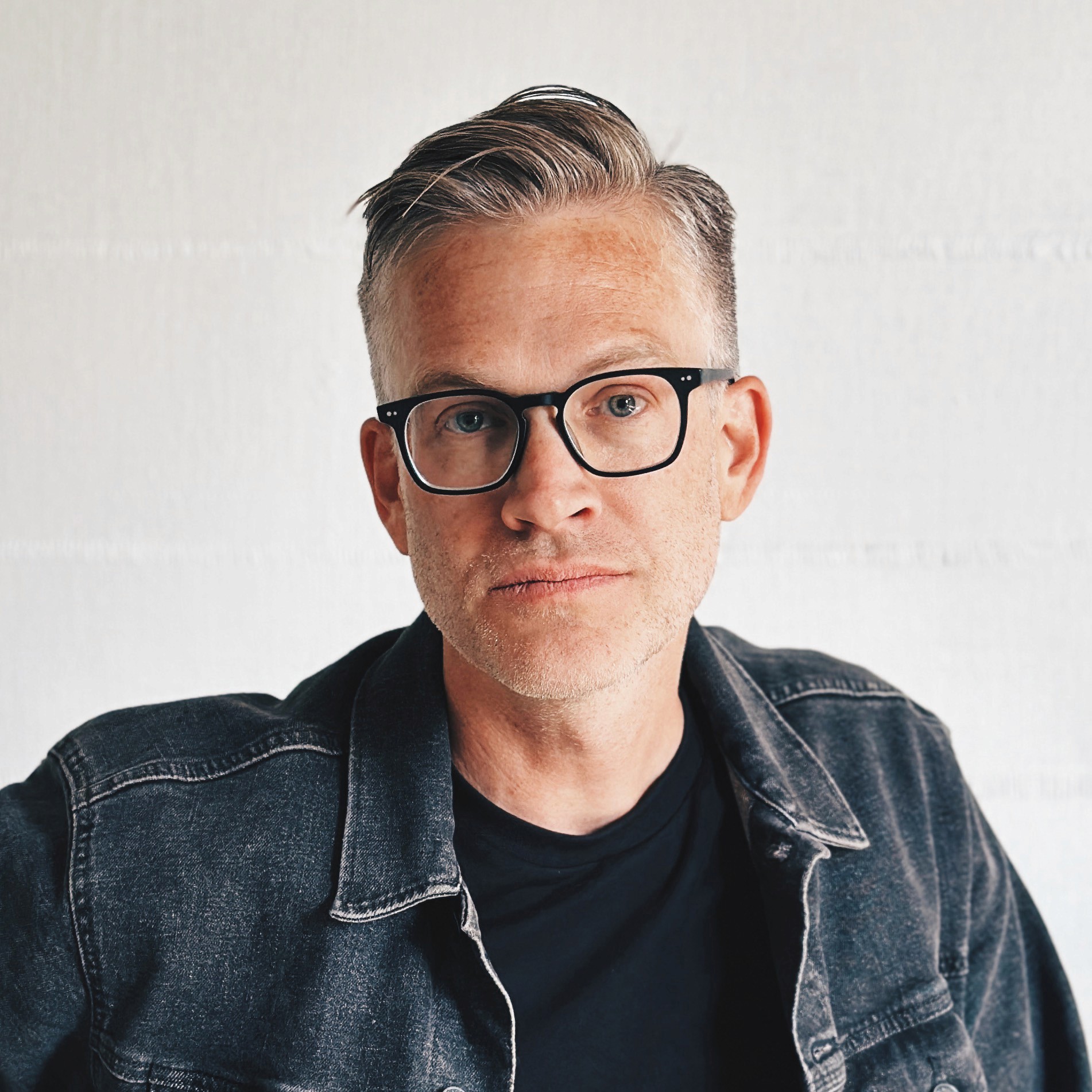
Kyle Eertmoed is the founder of Eertmoed Studio. Subscribe to get The Latest articles sent right to your inbox.